 info@luxurybusinesscards.com.au
 +44 203 332 0848

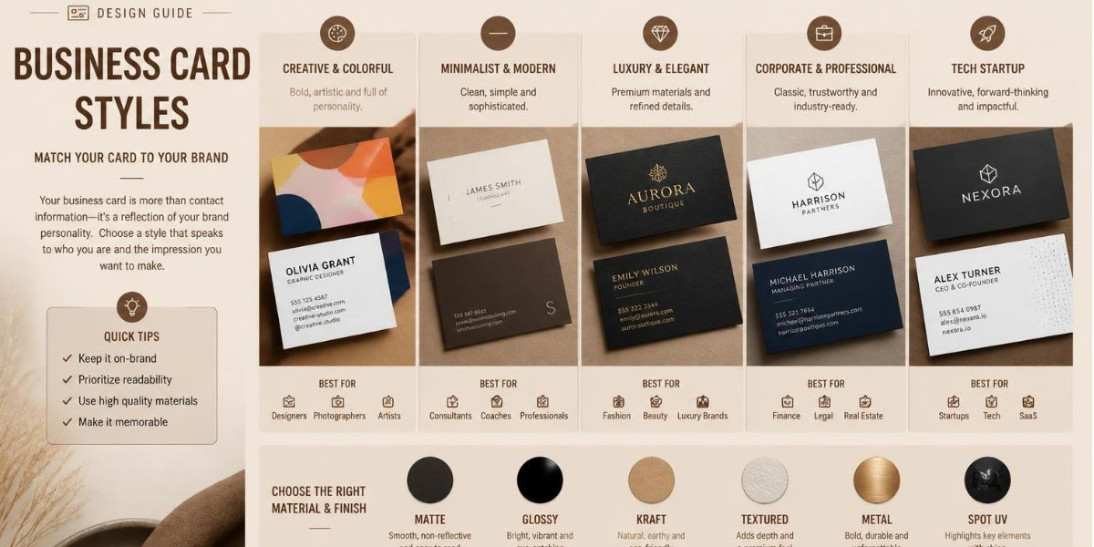
How to Choose the Right Business Card Style for Your Brand
Digital contacts save you a phone number. A business card still does something a saved contact can’t: it puts your brand in someone’s hand, at the exact moment they’re deciding whether to remember you. That’s why cards haven’t disappeared from serious networking, even in industries that run almost entirely online.
The part most people get wrong is treating every card the same way. A law firm, a new tech startup, and a growing team hiring its first ten staff don’t need the same card. They need one that fits where the business actually stands.
Match The Style To Your Brand
The right business card style isn’t really about trends. It comes down to one question: what does someone need to feel the moment they hold your card in their hand?
For an established law firm, that feeling is trust. For a startup still building its name, it’s relevance. For a growing team hiring its tenth or twentieth person, it’s consistency across everyone carrying that card.
None of these is solved the same way. A style built for a finance firm won’t suit a tech startup, and a startup’s approach won’t scale cleanly once a business starts growing its team. The sections below break this down by stage, so you can find the style that actually fits where your business stands right now, not where it might be in a few years.
Best Styles For Law, Finance, And Consulting
For law, finance, and consulting, the safest style is also the strongest one. Nothing loud, nothing trendy, just a card that feels solid the moment someone holds it.
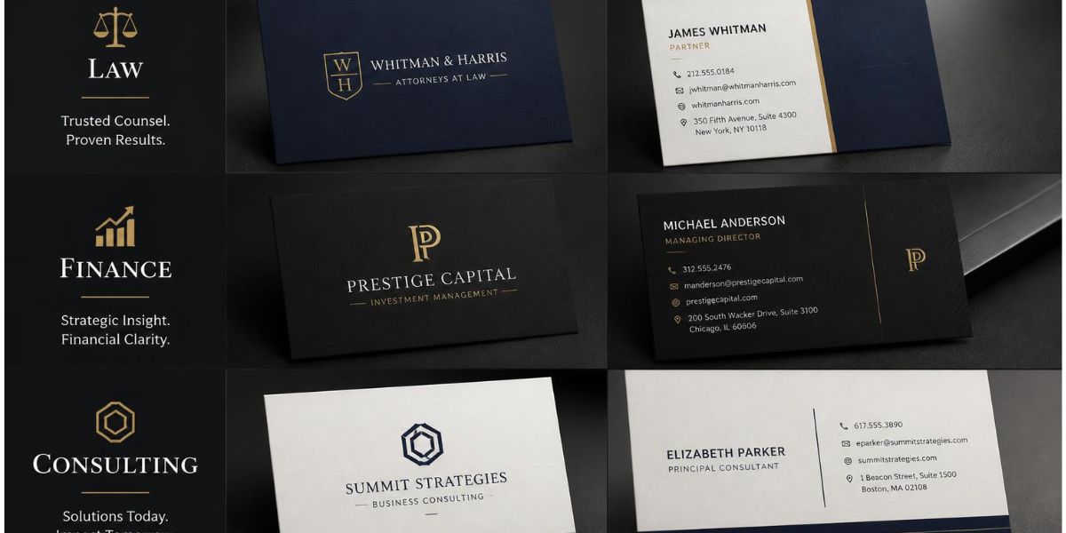
Law firms: dark tones
Matte black or deep navy cardstock reads as serious without trying too hard, and it holds up better across a career than anything trend-led.
Finance and accounting: thick cardstock
Go thick. Anything under 24 pt can feel closer to a flyer than a professional introduction, and in finance, that difference gets noticed fast.
Consultants: minimal typography
One clean serif or sans-serif font, generous spacing, and nothing competing for attention. Your name and title should be the first thing a client reads.
Real estate and private practice: one tactile detail
A single raised element, usually your name or logo, gives the card texture without turning it into a design exercise. This is where Engraved Business Cards do their best work, adding just enough presence to be felt before it’s read.
Best Styles For Startups And Tech
Startups don’t need a luxury card to look credible. They need one that works as hard as the business does, clean, quick to read, and easy to act on.
Tech startups: one accent colour
Stick to a single accent colour against a plain background. It keeps the card looking current without relying on trends that will date within a year or two.
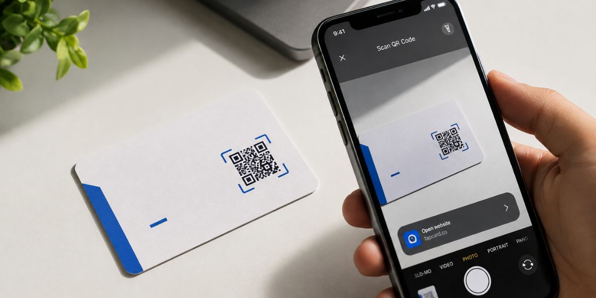
SaaS and app companies: NFC or QR code
A tap-to-share chip or a QR code linking straight to a booking page or portfolio saves someone typing out a website address later. Most people will scan it on the spot if it’s placed clearly.
Agencies and consultancies: legible fonts over decorative ones
A sharp sans-serif font signals modern and organised faster than any illustration can. Save the creative choices for your website, not the small print on a card.
Early-stage founders: simple layout, better print quality
A basic two-colour layout printed well will always beat a busy design printed cheaply. Budget goes further on quality stock than on extra design elements most people won’t notice anyway.
Pick The Right Cardstock
Cardstock is where most of the quality gets decided, and it costs less to get right than people expect. The thickness alone changes how a card feels before anyone reads a word on it.
| Cardstock | Feel | Best for |
| 100lb gloss | Thin, budget-friendly | Freelancers just starting out |
| 14–16pt | Standard, durable | Most small businesses |
| 24–32pt+ | Thick, premium | Corporate, finance, real estate |
Match the stock to where the business actually is, not where you want it to look like it is. A freelancer starting out doesn’t need 32pt cardstock, and a finance firm shouldn’t be handing out anything thinner than 24pt.
Build Cards That Scale Without A Redesign
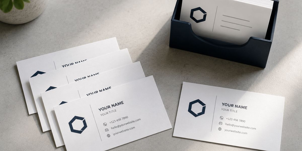
Growing teams need a card style that holds up as the business expands, not one that needs replacing every time headcount changes. A few styles work well here, each suited to a different kind of growing business.
- Uniform layout, one accent colour: A single template used across the whole team keeps the brand consistent as new staff join, without every card looking slightly different.
- Two-sided cards: Front for name and logo, back for department, direct line, or a QR code. This gives growing teams room for detail without cluttering the main design.
- Textured or soft-touch finish: A matte or soft-touch coating adds a premium feel without the extra cost of foil or embossing, useful for a business scaling on a tighter margin.
- Standard 14–16pt cardstock: Durable enough for daily handling at meetings and trade shows, without paying for the ultra-thick stock a smaller team doesn’t yet need.
This is where Custom NFC Business Cards earn their place, giving a growing business one style that works across the whole team instead of needing a new design each time it expands.
The Basics Every Card Needs
A few things matter no matter which style you choose.
Text size.
Keep everything at 8pt or larger. Anything smaller becomes hard to read, especially for contact details someone might glance at in low light.
Name priority.
Your name and business name should be the largest elements on the card, not squeezed in beside a logo or tagline.
Front and back split.
Use the front for your name, title, and logo. Save the back for contact details or a QR code.
Legibility over decoration.
A clean font that’s easy to read will always outperform a stylish one that slows someone down.
Get these right, and any style from the sections above will hold up in someone’s hand and their memory.
FAQs
What are the best types of business cards?
It depends on the industry. Standard cardstock works for everyday networking, NFC cards suit tech-forward businesses that want tap-to-share, and magnetic cards work well for local service providers people call back repeatedly, like clinics or tradespeople.
What colour business card is most effective?
There’s no single best colour, only what fits the industry. Navy and dark blue suit finance and legal for a sense of trust, black and charcoal suit premium or luxury services, and brighter tones suit creative or hospitality brands that want to stand out.
What’s a common mistake on business cards?
Overcrowding is the biggest one. Trying to fit every service, a long bio, or too many social handles onto one card makes it harder to read, not more impressive. Typos in phone numbers or emails are the other frequent, easily avoidable mistake.
Are business cards still relevant in 2026?
Yes. The format has shifted, with more QR codes and NFC taps supplementing paper, but face-to-face networking, trade shows, and industries like real estate still rely on a physical card as the first impression.
What should a professional business card look like?
Clean and uncluttered, with a name, title, company name, and one or two contact methods clearly visible. Text should sit at 8pt or larger, with enough white space that the card doesn’t feel busy at a glance.
Final Thoughts
There’s no single best business card, only the one that fits where your business actually stands. A law firm needs weight and restraint. A startup needs clarity and speed. A growing team needs consistency it can reorder without a redesign. Get the style right for your stage, and the card will do exactly what it’s meant to: get remembered, get kept, and get someone back in touch.

As the content specialist for LuxuryBusinessCards.com.au, I focus on sharing insights into luxury business cards, premium branding, and professional networking across Australia. My content explores high-end materials, specialty finishes, design trends, and brand presentation strategies that help businesses make lasting first impressions. Through informative and research-driven articles, I aim to help professionals and organizations strengthen their brand identity with distinctive, high-quality business cards.