 info@luxurybusinesscards.com.au
 +44 203 332 0848

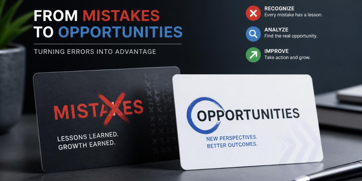
The 7 Business Card Mistakes Costing You New Clients
Most business cards don’t fail because of bad design. They fail because of small, easy-to-miss choices that quietly undo everything else on the card. A font that’s a touch too small. A layout trying to hold too much. Paper that feels thinner than it should.
None of these mistakes is dramatic on their own. But they add up, and they’re usually the reason a card gets glanced at once and never picked up again.
The good news is that each one is simple to fix once you know what to look for. That’s what this guide walks through.
Text People Can’t Actually Read
A card only works if someone can actually read it. That sounds obvious, but it’s one of the most common problems out there. Cursive or overly stylised fonts might look nice on a screen, but shrink them down to card size and they blur into guesswork. The same goes for contact details set too small to read without holding the card up to the light.
Keep it simple: use a clean, legible font, and don’t go below 8-10pt for names, numbers, and emails. If someone has to squint, they’ll skip it, and they definitely won’t call.
A little contrast between text and background also goes a long way. Dark text on a light card (or vice versa) reads instantly. Anything low-contrast makes people work for information they shouldn’t have to dig for.
Putting Too Much on the Card
A business card isn’t a resume. But plenty of cards try to be one, listing every service, every social handle, a tagline, and a job title that still doesn’t explain what the person actually does. The eye doesn’t know where to look, and the reader doesn’t stick around long enough to find out.
Too Much Information
If your card lists five phone numbers, three platforms, and a paragraph about your company, most of it will be ignored. Pick what actually matters and leave the rest for your website.
No Reason to Reach Out
A title like “Consultant” or “Manager” doesn’t tell anyone why they should call. One short line about what you actually help with does more work than a dozen icons ever will.
Fix it: name, one line on what you do, one way to reach you. That’s the card.
Colours That Look Different Once Printed
A design can look sharp and vibrant on a laptop screen, then come out muddy or slightly off once it’s actually printed. Screens and printers don’t read colour the same way, so a bright blue or a bold green on-screen can shift into something duller on paper.
This catches people off guard because nothing about the file looks wrong until it’s already printed.
The fix is simple: always ask for a physical proof before running a full batch. A quick test print shows exactly how the colours will look in hand, not just how they look on a monitor. It’s a small step, but it’s the difference between a card that matches your brand and one that just misses it.
Paper That Feels Cheap in Hand
A card can look great on screen and still fall flat the moment someone actually holds it. If it bends too easily or feels thin, that impression sticks, no matter how clean the design is.
What makes a card feel solid:
- Weight around 300gsm or higher, so it doesn’t flex or crease in a pocket
- A slight texture or coating instead of flat, standard paper
- Edges that stay sharp and clean, not soft or fraying after a few days
This is really a printing choice, not a design one. Working with proper business card printing Australia businesses trust means getting stock that’s actually built for handling, not just for looking good in a mock-up. It’s a small upgrade that changes how the card feels from the very first handshake.
The Back of the Card Is Wasted Space
Most cards use the front and completely ignore the back, even though it’s just as much real estate. That blank space could be doing something useful instead of sitting empty.
A QR code linking to a portfolio or booking page turns the back into an actual next step, not just decoration. A short tagline works too, if it says something specific about what you do. Even leaving room for someone to jot a quick note (“met at expo,” “call Thursday”) can be the reason your card doesn’t get tossed.
It’s a small space, but it doesn’t have to be an empty one.
Metal Business Cards: Worth the Upgrade?
Paper isn’t the only option anymore, and for some businesses, it isn’t even the best one. If your card needs to survive daily handling, or you simply want something that doesn’t blend in with the stack, material is worth rethinking before design.
Metal cards hold up in ways paper never will. They don’t bend, they don’t tear, and they don’t fade after a few months in a wallet. For anyone in a design-heavy, real estate, or high-end service field, that durability often says more about the brand than the logo does.
If that’s the direction you’re leaning, you can now buy metal business cards online Australia–wide, without needing a specialist print shop or a big minimum order. It’s a straightforward upgrade for a card that’s meant to be kept, not binned.
The Small Mistake That Undoes All the Others
Every mistake so far is about design or material. This one is simpler, and it’s the easiest to miss because it has nothing to do with how the card looks.
Before you send a card to print, check:
- Phone numbers and email are current, not from an old job or an old provider
- Website links actually work and go to the right page
- Spelling is correct, especially in names and titles
- Job title or role reflects what you actually do now
One typo or one dead number is enough to undo a well-designed card. Before printing, read it out loud and check every detail against the real thing. It takes a few minutes and it’s worth it.
FAQs
What is a common mistake on business cards?
The most common one is clutter: cramming in too many services, numbers, or social handles until nothing stands out. Illegible fonts and outdated contact details are close behind.
What information should be on a business card?
Name, what you do, and one way to reach you. Everything else, including extra numbers or a full list of services, is optional and usually gets in the way.
How do I make my business card stand out?
Keep the design simple, use a paper stock with real weight, and make sure the text is easy to read at a glance. A card that feels solid in hand stands out more than a busy design.
What is the most important information on a business card?
Your contact details, specifically the one method you actually respond to. A phone number or email you don’t check regularly does more harm than good.
Are business cards still relevant?
Yes. Even with digital networking, a physical card still gives people something to hold onto after a conversation, especially when it’s well made and easy to read.
Conclusion
None of these fixes requires a full redesign or a bigger budget. Most of them are small corrections: a font size, a paper choice, a proofread. What changes is how the card holds up once it leaves your hand.
A card that’s easy to read, feels solid, and has nothing outdated on it does more work than any clever design ever could. It’s the difference between something that gets kept and something that gets tossed by the end of the day.
Worth checking your own card against this list before you order the next batch.

As the content specialist for LuxuryBusinessCards.com.au, I focus on sharing insights into luxury business cards, premium branding, and professional networking across Australia. My content explores high-end materials, specialty finishes, design trends, and brand presentation strategies that help businesses make lasting first impressions. Through informative and research-driven articles, I aim to help professionals and organizations strengthen their brand identity with distinctive, high-quality business cards.